Digital art design, renderings, signatures and anything art related. Upload pictures of your newest work or ask for feedback. Post graphics requests or discuss art in general.
Last one seems pretty nice. Would perhaps look nicer with some psychedelic colors and such but this seems alright as well. If execution was also a bit better it would be my favorite one from you. Keep it up
I tried using colors but the background was already enough distraction. A bit more and the focus would be taken off Carlin - I had to put a fresh layer of his rendered image on top of the sig since the one underneath it blends in too much with the entire thing. I wanted him to "pop out."
I scraped 2 versions of this - 1 with a simple dark background and pentool light curves, the other was something similar to my Ariel Rebel sig. They both looked alright but it's kinda boring if I keep using the same style for my sigs.
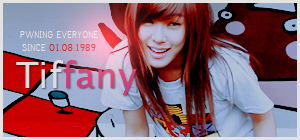
Yep. My girlfriend was the one who asked me to make a domo sig for her. I spent...let's just say a long time.. looking for a good stock image of domo to work on and a few sigs that got sent to the chopping block. =S
However, I am somewhat free to take on sig requests. Just not sure when I'll be done since I'm feeling lazy + not a lot of time.
inky wrote:Yep. My girlfriend was the one who asked me to make a domo sig for her. I spent...let's just say a long time.. looking for a good stock image of domo to work on and a few sigs that got sent to the chopping block. =S
However, I am somewhat free to take on sig requests. Just not sure when I'll be done since I'm feeling lazy + not a lot of time.
sure =D i will be looking forward to your work after i get my 75 post in
I got pretty lazy and I made one with a lot more effects last night but didn't like it. I like my stuff simple sometimes. =p Figured that one's decent enough for most people.
Kinda getting tired of sigs tbh. I'm reading up on editing photos right now. Also planning to read a couple of books or maybe take up a photography class.
No offence, but it seems to be going down in quality O__o? although the ski one is really nice. but really...it looks to me like it went from happy and colourful to awkward 80's videoclip bloom to...black and white D:
Day[9] wrote:"Tea is a lot like gold expansions - it helps you kill people." - Day[9] Daily 337 -
poehalcho wrote:No offence, but it seems to be going down in quality O__o? although the ski one is really nice. but really...it looks to me like it went from happy and colourful to awkward 80's videoclip bloom to...black and white D:
None taken. I know ^^
It's exactly why I'm gonna stop doing sigs for a bit. Or at least I'll make them when I feel like it but not post them. I already have some ideas on what to do but it requires a bit of reading on how to do certain things.
Just did a quick tag. Pretty much just practice and not really that content with the outcome but better than I expected after being dormant for months.
I like the use of text in your last 2 ones, something I don't do well. :d They seem fresh, I'd just like to see you continue practicing and all, keep it up.
Still trying to experiment with a new style and hoping it pays off in the end. Had a couple of ideas already so it's just a matter of learning the know-hows and executing it correctly.
I guess taking a break from making sigs was a good idea afterall.


 This is your brain on drugs, and it's fried to perfection.


 38
38
