Please leave your comments/critiques/rating.
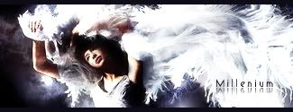
V1:
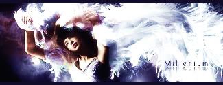
V2
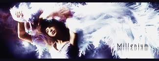
V3
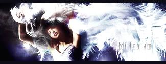
V4
Original
http://i187.photobucket.com/albums/x5/m ... /index.jpg


HOLLAstir wrote:V1 for me. I don't like the harsh purple clashing with the more soft blue/purple you have going on. I like the flow, the stock looks a little LQ, might want to sharpen it up. Text is too far away from the focal. And just personally, I don't like that mirror effect on the text with this tag. Good over all feel from it, like I said, really like the flow.


Cursed One wrote:i love it, i really like the version 2 and 3 because they have more colour to them ^.^
Snudge wrote:That's awesome, milly.I love to see how well you're progressing.


.rek wrote:I like v1. But i think the brightness kills the focal alittle bit. 7/10