
NSR ~ Noname :p
-
0l3n

- Elite Member
- Posts: 5184
- Joined: Fri Jun 16, 2006 1:45 pm
- Quick Reply: Yes
- Location: Artists Corner
Re: NSR ~ Noname :p
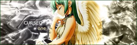
I like it, you could try to remove some of the black/clolor on the left side because the signature looks to split up. I like the general concept and the text looks great to.
The eye in the bottom just looks wierd, plain and simple.
The eye in the bottom just looks wierd, plain and simple.


-
Doron

- SRF's Princess
- Posts: 8570
- Joined: Sun May 20, 2007 9:37 am
- Quick Reply: Yes
- Location: I'm at- Ooh something shiny!!
Re: NSR ~ Noname :p
You say to me that I can work with color...
Well.. you can too!!
+1 on 0l3n, I don't like that lower eye.. it creaps me out..
Well.. you can too!!
+1 on 0l3n, I don't like that lower eye.. it creaps me out..

-
WaX
- Active Member
- Posts: 659
- Joined: Mon Sep 24, 2007 8:36 pm
- Quick Reply: Yes
- Location: Artist Corner
Re: NSR ~ Noname :p
I agree with 0l3n, the divide between b&w and colour is a lil too sudden for me and tht makin it feel seperated, but all else i like, text is nice also.
nj =]
nj =]
<<banned from SRF for bot admission. -SG>>
-
YangKang

- Active Member
- Posts: 838
- Joined: Wed Dec 13, 2006 4:26 pm
- Quick Reply: Yes
- Location: Uranus
Re: NSR ~ Noname :p
I made some more versions
One with color

One with a little light brushes

And one with better transition

One with color
One with a little light brushes
And one with better transition

-
iNunoPT

- Common Member
- Posts: 154
- Joined: Thu Aug 09, 2007 9:20 pm
- Quick Reply: Yes
- Location: quit sro long time ago
Re: NSR ~ Noname :p
imo colored is the best  rly like it
-
SuicideGrl

- Retired Admin
- Posts: 8004
- Joined: Fri Jan 27, 2006 4:17 pm
- Location: World of Warcraft
Re: NSR ~ Noname :p
i agree, colored version flows best. also, i wouldn't mind a border on this one. you don't always need one, but this one is so light in color on the right that i think it could benefit.

Thx IceCrash for my awesome sig :)
SRF Name Change Policy
Having trouble accessing SRF?
dom wrote:He's from Jersey. Close enough.RuYi wrote:Are you from outer space or something?
-
Cursed One

- Casual Member
- Posts: 98
- Joined: Thu May 31, 2007 9:16 pm
- Quick Reply: Yes
- Location: Artist Corner
-
YangKang
- Active Member
- Posts: 838
- Joined: Wed Dec 13, 2006 4:26 pm
- Quick Reply: Yes
- Location: Uranus
Re: NSR ~ Noname :p
SuicideGrl wrote:i agree, colored version flows best. also, i wouldn't mind a border on this one. you don't always need one, but this one is so light in color on the right that i think it could benefit.
It has a border
And thank you all for the positive comments ^_^
EDIT :

This is my finished sig only thing I may change is the c4d.
About the color, the colored version may look better but that would destroy my concept for the sig :/ I hope you like it!