Digital art design, renderings, signatures and anything art related. Upload pictures of your newest work or ask for feedback. Post graphics requests or discuss art in general.
Thanks Waisha for an awesome stock. I changed the text around a bit for the entry.
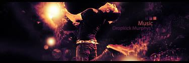
It really inspired me to make a piece with a lot of motions. I'd love to hear constructive criticisms and commments. Or anything you just don't like. I won't get offended, I just want to know how everybody thinks of it.
WOW, Milly! I think that this is your best work yet! I LOVE the brilliant light effect shining on his hands. They look perfect. I love the C4Ds you used. They fit in ever so nicely. Especially the C4D surrounding his foot like threads of fog. I think your text is perfectly placed. I think your font is good. Normally, I don't even like these colors. But quite honestly, I don't think I could see this tag with any other color.
Focal could be sharpened a bit more. I like the color choice and the smudging works well. It still feels really empty, would have liked to have a seen a little more variety. The softbrush flare by the shoe balances out the opposing side well. It's a good piece, well controlled, your best.
HOLLAstir wrote:Focal could be sharpened a bit more. I like the color choice and the smudging works well. It still feels really empty, would have liked to have a seen a little more variety. The softbrush flare by the shoe balances out the opposing side well. It's a good piece, well controlled, your best.
Variety is something I try to achieve too but I don't nkow a lot of ways to create effect other than clipping mask and smudging. I absolutely hate the excessive use of C4Ds or drawing vector brushes.
me two milli my advice to you is use what you have in more creative ways such as clipping masks-if you use the rectangle tool to draw an outline and change the perspectives a little you can make your own mirror smudging-experiment with different ways to smudge layer styles-if you think a layer doesnt look good, dont delete it right away, work with it a bit by playing around with the layer options or duplicating it and duing something different to its other layer to adjust the effects
Faiien wrote:smudging-experiment with different ways to smudge
Aha, you see, I have PS 7.0 so I dont' even have scattering option for smudging and all that. Can you imagine my pain?
Ugh - that sucks. Get CS2, nao.
Anyway, for some variation you could try picking a single colour you see in the signature, and blob that somewhere else, smudge it nicely and see how it turns out. Always remember to do this on a separate layer though, so you can just start that all over again if it sucks.
Another nice way is just trying out several filters. PS has plenty to play around with ;>
Waisha wrote:I really like your sig. I'm a sucker for sigs with few colors and I always like black in sigs. Just like you I loved the stock and I think you made an awesome job out of it. What I like most about the sig is the light sources to the left of the render.
The right side of the sig I also like alot. The c4d you used looks great and it fits with the style of the sig. I also think that part of the sig goes very well with the sig.
You didn't do very much to the left part but that awesome since it gives some kind of contrast to the light sources. And adding more c4d's would just make the sig look stuffed. I also love those things below the light sources, don't know what they are called but they look good there.
For the parts I don't like. Not very big issues really. For the first sig I was going to say the text, but then you made that second sig and it looks sweet. Although that font may be a little plain but then I have no idea how it would look with a more fancy font. It's really hard to give criticism to someone a lot better in the matter. One other thing I'm not sure of is if it would look better with some smudging on the sides of the render. I like the sharpness on his upper part. Again I'm just throwing something out. I don't know if it would look better or not.
^Scratch the c4d part. >_>
I don't understand how you made the drumset to what it is in the sig, but it looks good!
Faiien wrote:smudging-experiment with different ways to smudge
Aha, you see, I have PS 7.0 so I dont' even have scattering option for smudging and all that. Can you imagine my pain?
Ugh - that sucks. Get CS2, nao.
Anyway, for some variation you could try picking a single colour you see in the signature, and blob that somewhere else, smudge it nicely and see how it turns out. Always remember to do this on a separate layer though, so you can just start that all over again if it sucks.
Another nice way is just trying out several filters. PS has plenty to play around with ;>
I'll try smudging spots with different color. So far all my sigs have been monotone because I don't really know how to do multi-color. I'm stuck once again as the programming girl who can't do arts =( I'll keep trying though.
Millenium wrote:Aha, you see, I have PS 7.0 so I dont' even have scattering option for smudging and all that. Can you imagine my pain?
Ugh - that sucks. Get CS2, nao.
Anyway, for some variation you could try picking a single colour you see in the signature, and blob that somewhere else, smudge it nicely and see how it turns out. Always remember to do this on a separate layer though, so you can just start that all over again if it sucks.
Another nice way is just trying out several filters. PS has plenty to play around with ;>
I'll try smudging spots with different color. So far all my sigs have been monotone because I don't really know how to do multi-color. I'm stuck once again as the programming girl who can't do arts =( I'll keep trying though.
The fact that its really monotone bothers me alot. The lighting could use some work to, try spreading it out in a bigger area. I like the text ( wouldnt hurt to move it a little closer to the render though )and the depth is great to.
0l3n wrote:I do like it but not all that much actually.
The fact that its really monotone bothers me alot. The lighting could use some work to, try spreading it out in a bigger area. I like the text ( wouldnt hurt to move it a little closer to the render though )and the depth is great to.
I kind of understand what you mean. It was pretty hard to get the colors to come out and I only used the gradient map. The light is kind of bright too, but there was already a light there in the original stock so my only choice was to enchance it.
I think I did a good job with depth and text too and i luv you for mentioning it ^^
I'll post up what I fixed soon. I need to get back to Toronto first..