very first sig with photoshop

Digital art design, renderings, signatures and anything art related. Upload pictures of your newest work or ask for feedback. Post graphics requests or discuss art in general.
Post Reply
so STOOPS
Common Member
Posts: 137
Joined: Sat Dec 08, 2007 8:11 pm
Quick Reply: Yes
Location: Hercules
Contact:

very first sig with photoshop

Post by so STOOPS »

first of all i would like to say in my opinion, photoshop was very complicated. i tried to use renders but i ended up using just the mario hat and making my own stuff. turns out better than i expected =]


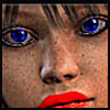
well since no one made me a sig i decided to make my own, i think it's okay =]
so basically, all i used was blur and maybe one or 2 brushes and text. any comments? you can rate it if you want. but i'm looking for criticism and what i can do to fix it

edit: forgot the sig LOL

Image
<<banned from SRF for rules violations: rule #5. -SG>>

User avatar
christina
Frequent Member
Posts: 1017
Joined: Sun Oct 07, 2007 6:58 pm
Quick Reply: Yes
Location: Artist Corner

Post by christina »

i can make you one, i cant go to bed.
Btw its not that bad for a first time.
Last edited by christina on Sat Dec 15, 2007 7:34 am, edited 1 time in total.
<<Left because of dumbshit people like stallowned>>

so STOOPS
Common Member
Posts: 137
Joined: Sat Dec 08, 2007 8:11 pm
Quick Reply: Yes
Location: Hercules
Contact:

Post by so STOOPS »

christina wrote:i can make you one, i cant go to bed.


my request is in the sig request forum, though i might try to make my own too. this is pretty fun =/ i'm actually preferring this over games O_o lol
<<banned from SRF for rules violations: rule #5. -SG>>

User avatar
HOLLAstir
Loyal Member
Posts: 1637
Joined: Tue Aug 28, 2007 7:17 pm
Quick Reply: Yes
Location: 206
Contact:

Post by HOLLAstir »

I'll just say nice attempt for your first time :) keep practicing!
Image

Image

so STOOPS
Common Member
Posts: 137
Joined: Sat Dec 08, 2007 8:11 pm
Quick Reply: Yes
Location: Hercules
Contact:

Post by so STOOPS »

omg where's the criticism and tips :banghead: well thanks for the comments :D
<<banned from SRF for rules violations: rule #5. -SG>>

User avatar
HOLLAstir
Loyal Member
Posts: 1637
Joined: Tue Aug 28, 2007 7:17 pm
Quick Reply: Yes
Location: 206
Contact:

Post by HOLLAstir »

K i'll just list little things:
-No border
-Seems to be two focal points (atleast to me) I see the text then I see the hat. Should only be one focal point
-Text is too big, placement
-Too simplistic of a background, very bland and empty
-render looks too blurry

Suggestions:

Keep practicing, Look up tutorials http://www.pixel2life.com has tutorials and google for tutorials to get some practice and learn techniques and get yourself more comfortable with photoshop and all it's tools. Good luck in the future <3 Don't give up!
Image

Image

User avatar
durkadurka
Common Member
Posts: 101
Joined: Thu Dec 06, 2007 5:34 pm
Quick Reply: Yes
Location: xian

Post by durkadurka »

the only advice or comment i can give you is the same that ive been dealing with...

first its a nice sig for your first one ^^ GJ

the hat around its edges is a bit too smudged, maybe a little less.

no border ( to create a border - create a new layer ontop of all other layers. press CNTRL A ... goto edit - stroke /// most use 2-5 px, and choose its color, then deselct by pressing CNTRL D )

the text doesnt really go with the sig and should be smaller. like size 9 or 10.

it seeems to have 2 focal points where as the hat is one, and the red blotch in the top left is another., the sigs should have 1 focal point.

good job tho. hoped the comments help
Image
Image

- 67 pure int spear nuker - xian - Death_2_ALL - gld ldr insane rage - 4 - 420 union -

- 45 pure int nuker s/s - pesodin -

Post Reply

Return to “Artists Corner”