Digital art design, renderings, signatures and anything art related. Upload pictures of your newest work or ask for feedback. Post graphics requests or discuss art in general.
binnosh
Regular Member
Posts: 201 Joined: Sun Aug 19, 2007 9:11 pmQuick Reply: YesLocation: Red Sea
Post
by binnosh Wed Nov 21, 2007 12:55 pm
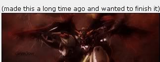
I got lots of time atm and i'm testing out all kinds of differnet styles for sigs so here goes the enxt one :p
C&C pls
lvl 6x lvl 5x lvl 4x Red Sea
0l3n
Elite Member
Posts: 5184 Joined: Fri Jun 16, 2006 1:45 pmQuick Reply: YesLocation: Artists Corner
Post
by 0l3n Wed Nov 21, 2007 3:35 pm
Looks ok, left side should be smoother like the right side imo.
christina
Frequent Member
Posts: 1017 Joined: Sun Oct 07, 2007 6:58 pmQuick Reply: YesLocation: Artist Corner
Post
by christina Wed Nov 21, 2007 7:48 pm
you took this guys thing or did he say you could???
I think it looks a little to sharp.
<<Left because of dumbshit people like stallowned>>
Snudge
Senior Member
Posts: 4200 Joined: Sun Jun 11, 2006 8:20 pmQuick Reply: YesLocation: Artist Corner
Contact:
Post
by Snudge Wed Nov 21, 2007 8:59 pm
Just the same render, Christina, just the same render.
<<banned from SRF for proof of botting. -SG>>
binnosh
Regular Member
Posts: 201 Joined: Sun Aug 19, 2007 9:11 pmQuick Reply: YesLocation: Red Sea
Post
by binnosh Wed Nov 21, 2007 10:16 pm
ooh cool, no didn't know he made that
just came across the same render as him i guess
i can show you screeny of my ps layers hing if you want to proove it :p
edit ooh lol!, i just went in his topic and saw the sig... i didn't even know he made it
sorry bout that
lvl 6x lvl 5x lvl 4x Red Sea
aazumak
Active Member
Posts: 918 Joined: Sat Jun 09, 2007 12:56 pmQuick Reply: YesLocation: Artist Corner
Contact:
Post
by aazumak Wed Nov 21, 2007 11:04 pm
to sharp imo,
GrimJow
Regular Member
Posts: 264 Joined: Tue Jun 19, 2007 4:36 pmQuick Reply: YesLocation: Hell
Post
by GrimJow Thu Nov 22, 2007 12:11 am
haha i first looked and had this face
and then i read the rest of the posts and took a second look at your sig and then i had this face
hah well anyways its pretty good...a bit too sharp for my taste though...and i dont really think that yellow part fits in
christina
Frequent Member
Posts: 1017 Joined: Sun Oct 07, 2007 6:58 pmQuick Reply: YesLocation: Artist Corner
Post
by christina Thu Nov 22, 2007 3:30 am
Snudge wrote: Just the same render, Christina, just the same render.
when i said it seemed kinda mean
I just ment like,
Did he say you could borrow the render?
But not like in a mean way
<<Left because of dumbshit people like stallowned>>
0l3n
Elite Member
Posts: 5184 Joined: Fri Jun 16, 2006 1:45 pmQuick Reply: YesLocation: Artists Corner
Post
by 0l3n Thu Nov 22, 2007 2:45 pm
christina wrote: Snudge wrote: Just the same render, Christina, just the same render.
when i said it seemed kinda mean
I just ment like,
Did he say you could borrow the render?
But not like in a mean way
Well unless grim painted that render himself its not for him to decide if binnosh is allowed to use it or not.
Bones
Casual Member
Posts: 63 Joined: Fri Aug 17, 2007 8:52 pmQuick Reply: YesLocation: Oasis
Post
by Bones Thu Nov 22, 2007 6:41 pm
there unique I like them
_UnKnOwN
Casual Member
Posts: 84 Joined: Mon Nov 19, 2007 6:19 pmQuick Reply: YesLocation: Artist Corner
Post
by _UnKnOwN Fri Nov 23, 2007 1:25 am
Nice! i agree with the others tho, slightly too sharp - otherwise a great effort