Digital art design, renderings, signatures and anything art related. Upload pictures of your newest work or ask for feedback. Post graphics requests or discuss art in general.
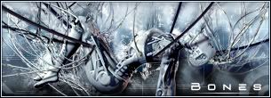
another attempt at learning the art of Sig'n
lemme know what you think, I know i've used the img before but i like it so i want to make it work. thanks
PS i know it needs a border but the PS i use is being wierd and only works on the left and bottom sides -.-
Got border to work and changed Text, i think it looks better
That render just creeps me out I find the background doesn't fit that choice of render, maybe grunge?
Try making the render a little more smoother and the rest just play with until your satisfied.
A little big for my liking and one thing I picked up from reading Rizla posts is that the text shouldn't be so close to the border might wanna move towards the center.
Hostage wrote: the text shouldn't be so close to the border might wanna move towards the center.
WTH... lolololol I love that. OMG it mad me laugh. I think I sprained a rib.
Text just around the edges looks vey plain. Doing something with the text like adding subtext or erasing some parts, just to add some effect.
Yes, in your humble opinion. lol I should tell all the people who ask me to make their sigs that after reading the srf ac, I find out I suck at doing it. I mean, I rarely use filters, abhor the free hand pen tool, think C4D's are hideous, dont use PS and apparently I generally put the text in the wrong place. HA HA HA HA
BTW, anyone seen draquish? lol
<<banned from SRF for rules violations: being a constant problem. -SG>>
Hostage wrote: the text shouldn't be so close to the border might wanna move towards the center.
WTH... lolololol I love that. OMG it mad me laugh. I think I sprained a rib.
Glad I could put a smile on your face tells me I'm doing a good job Oh and btw like I said in my previous post this is just sumthing I picked up from reading in AC over and over again