Digital art design, renderings, signatures and anything art related. Upload pictures of your newest work or ask for feedback. Post graphics requests or discuss art in general.
Foilin
Frequent Member
Posts: 1200 Joined: Wed May 10, 2006 6:47 pmQuick Reply: YesLocation: Once Xian, Now Garrosh (US). TEXAS IRL!
Post
by Foilin Fri Oct 05, 2007 9:33 pm
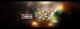
so after looking at tuts and things like that i kinda tried to add what i had read/learned together. rate it please, tell me what i can improve on ect ect
Gusy
Active Member
Posts: 561 Joined: Mon Jun 18, 2007 11:23 amQuick Reply: YesLocation: Venus
Post
by Gusy Sat Oct 06, 2007 12:06 am
Really nice cept a lil too big for me
8? I dono, I'm not good with rating things
I know my sig and avatar is outdated..
Hostage
Veteran Member
Posts: 3119 Joined: Thu Jan 25, 2007 8:34 pmQuick Reply: YesLocation: Canada,On
Post
by Hostage Sat Oct 06, 2007 12:35 am
the word "ironman" kinda looks outta place ,unno it could just be me but it looked odd to me at first glance other wise really nice.
rek
Ex-Staff
Posts: 5607 Joined: Sun Dec 31, 2006 10:46 amQuick Reply: YesLocation: darkroot garden
Contact:
Post
by rek Sat Oct 06, 2007 1:28 am
There is two focals in your sig, and thats a bad thing. And when you choose colours choose ones that match with the sig. And the flow could you some work, its the was things go.. direction.
<3
0len
Foilin
Frequent Member
Posts: 1200 Joined: Wed May 10, 2006 6:47 pmQuick Reply: YesLocation: Once Xian, Now Garrosh (US). TEXAS IRL!
Post
by Foilin Sat Oct 06, 2007 3:11 am
And the flow could you some work, its the was things go.. direction.
WTF? Does not Compute o_O
rek
Ex-Staff
Posts: 5607 Joined: Sun Dec 31, 2006 10:46 amQuick Reply: YesLocation: darkroot garden
Contact:
Post
by rek Sat Oct 06, 2007 3:53 am
Direction... You see how ironman looks like he is flying left? but you have lines going evywhere.. these lines conflict with the "flow".
<3
0len
Hostage
Veteran Member
Posts: 3119 Joined: Thu Jan 25, 2007 8:34 pmQuick Reply: YesLocation: Canada,On
Post
by Hostage Sat Oct 06, 2007 5:04 am
Foilin wrote: And the flow could use some work, its the way things go.. direction.
WTF? Does not Compute o_O
I think thats what he meant
[SD]Kratos
Senior Member
Posts: 4785 Joined: Mon Apr 24, 2006 9:48 amQuick Reply: YesLocation: Venus
Post
by [SD]Kratos Sat Oct 06, 2007 8:11 am
something u can easily improve is the text
Now about the flow, if the lines were going in same direction as ironman, it would be really better i think.
Did u use a fractal creation program or just a filter?
rek
Ex-Staff
Posts: 5607 Joined: Sun Dec 31, 2006 10:46 amQuick Reply: YesLocation: darkroot garden
Contact:
Post
by rek Sat Oct 06, 2007 8:18 am
Brushes, my friend.
<3
0len
[SD]Kratos
Senior Member
Posts: 4785 Joined: Mon Apr 24, 2006 9:48 amQuick Reply: YesLocation: Venus
Post
by [SD]Kratos Sat Oct 06, 2007 9:08 am
reK wrote: Brushes, my friend.
fractal brushes? thats gay!
Better create ur own fractal and then put it as layer :O me thinks
HavinFunSince89
Common Member
Posts: 190 Joined: Sat Aug 18, 2007 4:26 amQuick Reply: YesLocation: artist corner
Post
by HavinFunSince89 Sat Oct 06, 2007 1:16 pm
I have just one thing to say this is just like what rizla said before.
BrokenSaint
Veteran Member
Posts: 3473 Joined: Sun Jan 01, 2006 8:49 pmQuick Reply: YesLocation: Stuntin'.
Contact:
Post
by BrokenSaint Sun Oct 07, 2007 2:23 am
I believe he DID choose colors that matched with the focal, just the color balance needs work I guess.
Shadowman20818
Loyal Member
Posts: 1506 Joined: Wed Jul 18, 2007 12:19 am
Post
by Shadowman20818 Sun Oct 07, 2007 2:30 am
Just select color and get it over with.
-Back in '08-


