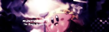
NSR~

Digital art design, renderings, signatures and anything art related. Upload pictures of your newest work or ask for feedback. Post graphics requests or discuss art in general.
Post Reply
User avatar
runtypoo
Casual Member
Posts: 83
Joined: Thu Jan 04, 2007 4:11 am
Quick Reply: Yes
Location: Australia

NSR~

Post by runtypoo »

Image

got cs3.
made a sprite:)
comment and criticise
Image
Image
Image

cin

Post by cin »

just a quick comment.. try put a lighting effect on it, for example a spotlight
bright in the top left, dark in the bottom right... i think after that i will like it. :)

Snudge
Senior Member
Posts: 4200
Joined: Sun Jun 11, 2006 8:20 pm
Quick Reply: Yes
Location: Artist Corner
Contact:

Post by Snudge »

cin wrote:just a quick comment.. try put a lighting effect on it, for example a spotlight
bright in the top left, dark in the bottom right... i think after that i will like it. :)


You're not supposed to like sprites. :x

Looks good, Runtypoo.
<<banned from SRF for proof of botting. -SG>>

User avatar
runtypoo
Casual Member
Posts: 83
Joined: Thu Jan 04, 2007 4:11 am
Quick Reply: Yes
Location: Australia

Post by runtypoo »

thanks snudge.
yours are good too.
Image
Image
Image

User avatar
Dugu
Casual Member
Posts: 64
Joined: Sun Jul 08, 2007 1:13 pm
Quick Reply: Yes
Location: Come find me

Post by Dugu »

Went too far on lighting effects and not enough on others.

The colors you choose were a sort of happy cynical, which is my way of saying cold colors w/o black. Although they match your sprite, the colors near the sprite itself does not make your render stand out.

The light-------->dark contrast that you're going for is there and I can plainly see it, but it's just an "eh". While the brush strokes/smudge or however your did your color is nice, it needs to have a direction, not necessarily flow, but some sort of recognizable organization. Even if it's random and chaotic, unless your just splatting brushes against a white canvas, you want people to look at it and say "AHHH, that's chaotic, cool." Right now yours screams nice colors, vivid, effects, and text & render.

The light source you chose does not carry over to your render for some strange reason, nor your text. You need to work on making a focal THE focal, not "hey, that's nice, that's nice too, and that one" to a more "WOW!!! and the background effects are good too!"

Your render looks a bit over sharpened, which would not be a problem against a smudged background, but you seemed to have sharpened around the edge of the render onto the background.

I mentioned text there but I'll say it again, after viewers are done with the big picture and first impressions they want to see things like text and render clearly.

Random yellow bar to the top-left of your render, dunno why that's there.

Definitely sig worthy.
Charles Caleb Colton wrote:We hate some persons because we do not know them; and will not know them because we hate them.

Image

User avatar
Rizla
Ex-Staff
Posts: 1197
Joined: Sun Jun 11, 2006 4:17 am
Quick Reply: Yes
Location: Artist's Corner

Post by Rizla »

Dugus back? wherefore art though dugu? stay with us!
Image

User avatar
Dugu
Casual Member
Posts: 64
Joined: Sun Jul 08, 2007 1:13 pm
Quick Reply: Yes
Location: Come find me

Post by Dugu »

I've been trying to cap my level 69 Chinese bladder, and college is back in session soon so I'll have to move back on campus, all in all not much time for SRF and AC, but I still post now and then.

Nice to see you're a moderator now Rizla, you deserve it.
Charles Caleb Colton wrote:We hate some persons because we do not know them; and will not know them because we hate them.

Image

User avatar
doa_master0
Regular Member
Posts: 237
Joined: Wed May 24, 2006 7:32 pm
Quick Reply: Yes
Location: Athens

Post by doa_master0 »

Dugu wrote:Went too far on lighting effects and not enough on others.

The colors you choose were a sort of happy cynical, which is my way of saying cold colors w/o black. Although they match your sprite, the colors near the sprite itself does not make your render stand out.

The light-------->dark contrast that you're going for is there and I can plainly see it, but it's just an "eh". While the brush strokes/smudge or however your did your color is nice, it needs to have a direction, not necessarily flow, but some sort of recognizable organization. Even if it's random and chaotic, unless your just splatting brushes against a white canvas, you want people to look at it and say "AHHH, that's chaotic, cool." Right now yours screams nice colors, vivid, effects, and text & render.

The light source you chose does not carry over to your render for some strange reason, nor your text. You need to work on making a focal THE focal, not "hey, that's nice, that's nice too, and that one" to a more "WOW!!! and the background effects are good too!"

Your render looks a bit over sharpened, which would not be a problem against a smudged background, but you seemed to have sharpened around the edge of the render onto the background.

I mentioned text there but I'll say it again, after viewers are done with the big picture and first impressions they want to see things like text and render clearly.

Random yellow bar to the top-left of your render, dunno why that's there.

Definitely sig worthy.


FIRST OF ALL
What Does Sprite actually mean!!! I thought it meant moving image


I hate this Guy... How do u even know about Focal Points and Organizing Paints.... All i really do is "ooh this looks good".. and "oh right there ill leave that there , it fits" i dont really plan anything i Dont know how to I feel So behind.... Garsh!
Cut, Copy, Paste, Art Kung Fu ^_^ Image
Image
^^Thanks a Bunch to Cin^^

User avatar
rek
Ex-Staff
Posts: 5607
Joined: Sun Dec 31, 2006 10:46 am
Quick Reply: Yes
Location: darkroot garden
Contact:

Post by rek »

doa_master0 wrote:
Dugu wrote:Went too far on lighting effects and not enough on others.

The colors you choose were a sort of happy cynical, which is my way of saying cold colors w/o black. Although they match your sprite, the colors near the sprite itself does not make your render stand out.

The light-------->dark contrast that you're going for is there and I can plainly see it, but it's just an "eh". While the brush strokes/smudge or however your did your color is nice, it needs to have a direction, not necessarily flow, but some sort of recognizable organization. Even if it's random and chaotic, unless your just splatting brushes against a white canvas, you want people to look at it and say "AHHH, that's chaotic, cool." Right now yours screams nice colors, vivid, effects, and text & render.

The light source you chose does not carry over to your render for some strange reason, nor your text. You need to work on making a focal THE focal, not "hey, that's nice, that's nice too, and that one" to a more "WOW!!! and the background effects are good too!"

Your render looks a bit over sharpened, which would not be a problem against a smudged background, but you seemed to have sharpened around the edge of the render onto the background.

I mentioned text there but I'll say it again, after viewers are done with the big picture and first impressions they want to see things like text and render clearly.

Random yellow bar to the top-left of your render, dunno why that's there.

Definitely sig worthy.


FIRST OF ALL
What Does Sprite actually mean!!! I thought it meant moving image


I hate this Guy... How do u even know about Focal Points and Organizing Paints.... All i really do is "ooh this looks good".. and "oh right there ill leave that there , it fits" i dont really plan anything i Dont know how to I feel So behind.... Garsh!


The use of "." helps. And try not to put random capital letters in the middle of what ur saying.
Image
<3
0len

Snudge
Senior Member
Posts: 4200
Joined: Sun Jun 11, 2006 8:20 pm
Quick Reply: Yes
Location: Artist Corner
Contact:

Post by Snudge »

doa_master0 wrote:FIRST OF ALL
What Does Sprite actually mean!!! I thought it meant moving image


I hate this Guy... How do u even know about Focal Points and Organizing Paints.... All i really do is "ooh this looks good".. and "oh right there ill leave that there , it fits" i dont really plan anything i Dont know how to I feel So behind.... Garsh!


Sprite [In 'signature land' that is] means a small bitmap image, often taken from moving GIF's which fits completely within the borders of the sig.
Well, that's my interpretation. :)
<<banned from SRF for proof of botting. -SG>>

User avatar
doa_master0
Regular Member
Posts: 237
Joined: Wed May 24, 2006 7:32 pm
Quick Reply: Yes
Location: Athens

Post by doa_master0 »

Ok now i have a clearer Understandign, because i thought i was losing grip on AC lingo
Cut, Copy, Paste, Art Kung Fu ^_^ Image
Image
^^Thanks a Bunch to Cin^^

Post Reply

Return to “Artists Corner”