Dream~

Digital art design, renderings, signatures and anything art related. Upload pictures of your newest work or ask for feedback. Post graphics requests or discuss art in general.
Post Reply
Snudge
Senior Member
Posts: 4200
Joined: Sun Jun 11, 2006 8:20 pm
Quick Reply: Yes
Location: Artist Corner
Contact:

Dream~

Post by Snudge »

New sig ^^ Had no idea what to add as a border :/
Image

C&C pl0x. I think I'm in love with smudge. :D
<<banned from SRF for proof of botting. -SG>>

User avatar
Dystopia
Advanced Member
Posts: 2317
Joined: Thu Jan 04, 2007 8:37 pm
Quick Reply: Yes
Location: Off Topic

Post by Dystopia »

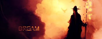
Nice job with the text, colors are good, what you can improve is the dots around what i think is a staff, the text is perfect, i liked your other one more, that one was hooottt
Image

User avatar
CrimsonNuker
Dom's Slut
Posts: 13791
Joined: Sun Aug 06, 2006 3:31 am
Quick Reply: Yes
Location: guildwars2

Post by CrimsonNuker »

I like the text, but not digging the sig in general
ImageImageImage

User avatar
dom
Global Moderator
Global Moderator
Posts: 9962
Joined: Wed Mar 08, 2006 10:46 pm
Quick Reply: Yes
Location: västkustskt

Post by dom »

I Really dislike the text. The gap on the right and left side of Snudge should be even, dream should also have more weight.
Image

User avatar
Rizla
Ex-Staff
Posts: 1197
Joined: Sun Jun 11, 2006 4:17 am
Quick Reply: Yes
Location: Artist's Corner

Post by Rizla »

dom wrote:I Really dislike the text. The gap on the right and left side of Snudge should be even, dream should also have more weight.


Looks even to me :/ But I agree with the font weight suggestion.

Looks neat snudge, but it leaves me wanting more....:(
Image

User avatar
dom
Global Moderator
Global Moderator
Posts: 9962
Joined: Wed Mar 08, 2006 10:46 pm
Quick Reply: Yes
Location: västkustskt

Post by dom »

Rizla wrote:
dom wrote:I Really dislike the text. The gap on the right and left side of Snudge should be even, dream should also have more weight.


Looks even to me :/ But I agree with the font weight suggestion.

Looks neat snudge, but it leaves me wanting more....:(


it's in the center of dream, however there are 0 pixels next to the e and a bunch between the S and the inside of the D. I find it looks weird, a low opacity bolded DREAM behind it would be more suited imo.
Image

User avatar
aazumak
Active Member
Posts: 918
Joined: Sat Jun 09, 2007 12:56 pm
Quick Reply: Yes
Location: Artist Corner
Contact:

Post by aazumak »

text is A++

colors along with lighting is good, the dots on the right , u prob coulkd done some cool smudging with them
Image
Image
_____________________!!!!!!Rogue 7X !!!!!!
Image

User avatar
lavapockets
Frequent Member
Posts: 1126
Joined: Fri May 25, 2007 3:27 pm
Quick Reply: Yes
Location: right behind you

Post by lavapockets »

:love: oh me likey...they covered the text critique, which is all I would have said. I personally like the bubbles next to the staff...

I think Az's style border would look really nice on this, did you try that?
Image
Image

Post Reply

Return to “Artists Corner”