NSR & need help

Digital art design, renderings, signatures and anything art related. Upload pictures of your newest work or ask for feedback. Post graphics requests or discuss art in general.
Post Reply
cin

NSR & need help

Post by cin »

hey

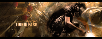
i tried to make a friend of mine a nice sig.
im pretty happy with it, i tried out stuff with reK's vector mask tut and i did
some blurring and whatever and i kindof like the text on this one myself :)

would just like a rating -/10 and some comment so i can improve it more for
him :)

thnx in advance 8)

Image

Image
Last edited by cin on Thu Jul 05, 2007 10:49 am, edited 1 time in total.

pherball
Valued Member
Posts: 398
Joined: Wed Jul 19, 2006 6:16 am
Quick Reply: Yes
Location: Xian

Post by pherball »

blurry, not fit into bg text on edge
Image

User avatar
Dystopia
Advanced Member
Posts: 2317
Joined: Thu Jan 04, 2007 8:37 pm
Quick Reply: Yes
Location: Off Topic

Post by Dystopia »

hmm, yeah its kind blurry, try adding different photofilters see what looks best try warm, i think that would look better

i liek the spacy feel to it 7.5/10
Image

cin

Post by cin »

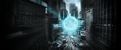
edited it a bit.. that better?

TwelveEleven
Veteran Member
Posts: 3806
Joined: Sat Mar 17, 2007 1:11 am
Quick Reply: Yes
Location: Heaven
Contact:

Post by TwelveEleven »

No, the render is too blurry.. Perhaps you should sharpen it a bit.
<<banned from SRF for proof of botting. -SG>>

User avatar
0l3n
Elite Member
Posts: 5184
Joined: Fri Jun 16, 2006 1:45 pm
Quick Reply: Yes
Location: Artists Corner

Post by 0l3n »

Looks ok but yeah the render is to blurry, may I ask how you did the background?

6.5/10
Image
Image

cin

Post by cin »

0l3n wrote:Looks ok but yeah the render is to blurry, may I ask how you did the background?

6.5/10

i googled it. im not that pro :P all i did was make a vector mask using
reK's tutorial and some lighting effects.

User avatar
Rizla
Ex-Staff
Posts: 1197
Joined: Sun Jun 11, 2006 4:17 am
Quick Reply: Yes
Location: Artist's Corner

Post by Rizla »

cut back on the lighting on his face, increase the lighting on the pocketwatch (like you had the first time plus a smidge more), and darken the area "behind"him a bit - those are some shortcuts (because there are longer, better ways) to grab some depth and make your lighting look 'realistic'
Image

User avatar
CrimsonNuker
Dom's Slut
Posts: 13791
Joined: Sun Aug 06, 2006 3:31 am
Quick Reply: Yes
Location: guildwars2

Post by CrimsonNuker »

Apply image then sharpen the whole thing and erase the parts you dont like :)
ImageImageImage

Post Reply

Return to “Artists Corner”