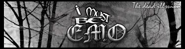
NOT OFFICIAL FLAG ADJUSTMENT

Digital art design, renderings, signatures and anything art related. Upload pictures of your newest work or ask for feedback. Post graphics requests or discuss art in general.
Post Reply
User avatar
CrimsonNuker
Dom's Slut
Posts: 13791
Joined: Sun Aug 06, 2006 3:31 am
Quick Reply: Yes
Location: guildwars2

NOT OFFICIAL FLAG ADJUSTMENT

Post by CrimsonNuker »

Before.
Image
After.
V1.Image V2. Image Just for the person that asked me to lighten the corners.

Changes:
-Made text a bit bigger since it was hard to read for some people.
-Adjusted the logo
-Changed the Silkroad Forums to SRF (Not too sure about this, ill do some experimenting)
-Repositioned SRF (")

Not Changed:
-Text because i know a lot of people love it
-Size, i think its a pretty good size (Because it wont stretch the side panel or anything.
-Border, because it looks good

Please if you liked the old one better or this one tell me, or state changes you would like to see.
--------------------------------------------------------------------------------------
-Okay well, my V1 looks too plain, so..im gonna scratch that out.
-I will probably keep my older flags with the acceptions of making the letters bigger and getting rid of the pixel dots on the logo.
Last edited by CrimsonNuker on Sat Jun 16, 2007 6:24 am, edited 3 times in total.
ImageImageImage

User avatar
exality
Loyal Member
Posts: 1802
Joined: Wed Mar 07, 2007 6:31 am
Quick Reply: Yes
Location: **** if i know

Post by exality »

it looks to plain now imo
Image
Image

User avatar
the.dead.illusion
Regular Member
Posts: 205
Joined: Thu Mar 29, 2007 8:05 am
Quick Reply: Yes
Location: in the corner
Contact:

Post by the.dead.illusion »

how bout making it look more like a FLAG
Image
Image
Image
^sig wars^

User avatar
ElMejorGlavie
Active Member
Posts: 577
Joined: Mon Apr 23, 2007 9:33 am
Quick Reply: Yes
Location: Oasis

Post by ElMejorGlavie »

It doesn't have to be a FLAG It jut has to represent your server in a nice way. I say the only problem is the silkroad icon is blurry, makes it look un proffesional. Fix that it deserves to win.
Image

IGN: xPaynex
Server: Oasis
Lvl: 6X
Guild: Oathkeepers

User avatar
the.dead.illusion
Regular Member
Posts: 205
Joined: Thu Mar 29, 2007 8:05 am
Quick Reply: Yes
Location: in the corner
Contact:

Post by the.dead.illusion »

okkk, but still making it like a flag would be nice :D

and im not "full" emo, i just look like an emo...
ararhahhh
Image
Image
Image
^sig wars^

User avatar
CrimsonNuker
Dom's Slut
Posts: 13791
Joined: Sun Aug 06, 2006 3:31 am
Quick Reply: Yes
Location: guildwars2

Post by CrimsonNuker »

Go to SRF Flags thread, i have a more updated version of this post there.
ImageImageImage

User avatar
Rizla
Ex-Staff
Posts: 1197
Joined: Sun Jun 11, 2006 4:17 am
Quick Reply: Yes
Location: Artist's Corner

Post by Rizla »

imo they needed to be darker, not lighter
Image

Luoma
Veteran Member
Posts: 3895
Joined: Thu Sep 14, 2006 8:23 am
Quick Reply: Yes
Location: Artists Corner & Aege

Post by Luoma »

I liked them alot the way they were >_>
<<banned from SRF for proof of botting. -SG>>

User avatar
the.dead.illusion
Regular Member
Posts: 205
Joined: Thu Mar 29, 2007 8:05 am
Quick Reply: Yes
Location: in the corner
Contact:

Post by the.dead.illusion »

yea...its kindof good cause it kindof matches with the navigation titles on the left
Image
Image
Image
^sig wars^

User avatar
CrimsonNuker
Dom's Slut
Posts: 13791
Joined: Sun Aug 06, 2006 3:31 am
Quick Reply: Yes
Location: guildwars2

Post by CrimsonNuker »

Damnit guys, i really wish i had saved the .psd files for them >_<
ImageImageImage

User avatar
DarkJackal
Elite Member
Posts: 6119
Joined: Mon Feb 20, 2006 7:23 pm
Quick Reply: Yes
Location: A den~
Contact:

Post by DarkJackal »

Is it me or is the announcement topic gone? lol.
Image

User avatar
RuYi
Ex-Staff
Posts: 7145
Joined: Tue Apr 25, 2006 7:39 am
Location: Done.

Post by RuYi »

DarkJackal wrote:Is it me or is the announcement topic gone? lol.

It's gone. :(
Image

User avatar
DarkJackal
Elite Member
Posts: 6119
Joined: Mon Feb 20, 2006 7:23 pm
Quick Reply: Yes
Location: A den~
Contact:

Post by DarkJackal »

Maybe rek deleted it on accident lol xP.
Image

User avatar
rek
Ex-Staff
Posts: 5607
Joined: Sun Dec 31, 2006 10:46 am
Quick Reply: Yes
Location: darkroot garden
Contact:

Post by rek »

-__-" its in discussion
Image
<3
0len

User avatar
DarkJackal
Elite Member
Posts: 6119
Joined: Mon Feb 20, 2006 7:23 pm
Quick Reply: Yes
Location: A den~
Contact:

Post by DarkJackal »

reK wrote:-__-" its in discussion

lol kk. :P
Image

User avatar
Orilana
Regular Member
Posts: 267
Joined: Wed Apr 11, 2007 6:16 pm
Quick Reply: Yes
Location: Alps

Post by Orilana »

I think it needs a little more contrast. The text is too light compared to the background.
Image
The difference between genius and stupidity is; genius has its limits.

User avatar
chesticles
Loyal Member
Posts: 1978
Joined: Thu May 10, 2007 1:41 pm
Quick Reply: Yes
Location: Off Topic
Contact:

Post by chesticles »

Orilana wrote:I think it needs a little more contrast. The text is too light compared to the background.


i agree he does need to make the text a tiny bit darker but mainly he just needs to tone down the shine at the top
Image
Image


Want to play Jade Dynasty and get a bunch of free stuff?
In USA-East, The Billows
My Inductor ID is 8390004X080400090002522Z0d21fe
Copy that code and paste it in the box when you make a new character.

shadowman20875

Post by shadowman20875 »

V1 looks too empty, I like V2.

User avatar
Priam
Forum Legend
Posts: 7885
Joined: Tue Jul 11, 2006 8:38 am
Quick Reply: Yes
Location: At the apple store, Cause i'm an iAddict.

Post by Priam »

agreed on the emptyness, but my opinion about the rotated square logo with the point sticking out remains, its ugly. imo.
Image

User avatar
dom
Global Moderator
Global Moderator
Posts: 9962
Joined: Wed Mar 08, 2006 10:46 pm
Quick Reply: Yes
Location: västkustskt

Post by dom »

Please no cursive fonts - they don't like nice unless you use them at big sizes (26+)
Image

shadowman20875

Post by shadowman20875 »

dom wrote:Please no cursive fonts - they don't like nice unless you use them at big sizes (26+)

Nah, I like the silky cursive fonts, although the light coming from up top should be changed, way too bright.

User avatar
CrimsonNuker
Dom's Slut
Posts: 13791
Joined: Sun Aug 06, 2006 3:31 am
Quick Reply: Yes
Location: guildwars2

Post by CrimsonNuker »

I forgot to mention that ill change the font colour if its really necissary in my final submission. >_<
ImageImageImage

Post Reply

Return to “Artists Corner”