But i've been rading ol3n's tut and thought i should try making a sig. This is what came up, guided by the tut, but not following exactly
Don't be harsh, i know it's not perfect but oh well... i liked it and wanted to know if you liked it too

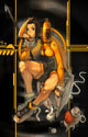
cin wrote:imo, the render should fit in the background somewhat better. it now seems
as if he is a she hehe is floating in the air and is doing that in front of the background. The position of both wasn't the adequate... and i'm not sure how to place them together correctly
perhaps you can also adjust the lighting a bit (i always have problemw with
lighting thats why i make simple sigs like the puss); try put a light source
on it somewhere.
Hehe this kind of comments were the reason i said "i barely spend time looking at the tools"if i knew how to do that i would, but to be honest i'm no artist, i just tried to join a good background with my char
i'll try, however, to find a way to achieve that "union".
last, the txt. no comment
BUT i do like the bg and the render is nice. just try to make us think they
belong together.
HyorunmarouZ wrote:cin wrote:imo, the render should fit in the background somewhat better. it now seems
as if he is a she hehe is floating in the air and is doing that in front of the background. The position of both wasn't the adequate... and i'm not sure how to place them together correctly
perhaps you can also adjust the lighting a bit (i always have problemw with
lighting thats why i make simple sigs like the puss); try put a light source
on it somewhere.
Hehe this kind of comments were the reason i said "i barely spend time looking at the tools"
last, the txt. no comment
BUT i do like the bg and the render is nice. just try to make us think they
belong together.


IT wrote:Okay, these things you might want to consider
- Text
- Flow and movement
- Boarder
- Lighting
Text, It honestly looks like its drawn on paint pick a better font and dont place it near the edges, or on the focal point
Flow,I see you made some sort of shadow for the focal, you might want to make that linear so it looks like it belongs to the focal, and not just some blob. And it sort of looks plain for that size, add something that will add to its flow, or change the size to 340x120 or something around that
Boarder, Im not sure you might be better off without, but just try it to see which looks better
Lighting, You might want to add a source of light, or increase the power of the power-up thingy on your glavie...