Digital art design, renderings, signatures and anything art related. Upload pictures of your newest work or ask for feedback. Post graphics requests or discuss art in general.
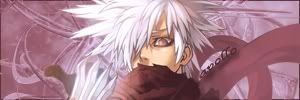
yes you're right,i should have put this in my old thread,sorry for that. I agree with the lighting that it needs some wotk (i will try to experiment a bi with that )and for the flow,i honestly dont know what do u mean. This is a "work in progress" sig so it isnt finished
Lol,i am still trying but i am slowly losing hope in making a good sig. Every time that i find a good tutorial i try to do a sig and when i think the result looks good i post here expecting something like 6/10 and than i find out that it sucks .
I tryed to add more flow to my sig and the result is ....that i gave up on that sig and decided to start a new one
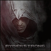
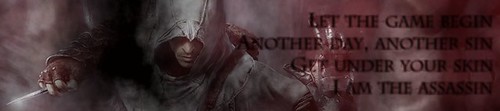
What do u think which one is better?
still no replays... someone please coment this sig becouse i dont know if i am going in the right direction with it. I think the last 2 are good but i am not an expert