Some sigs I created...Comments anyone?

Digital art design, renderings, signatures and anything art related. Upload pictures of your newest work or ask for feedback. Post graphics requests or discuss art in general.
Post Reply
User avatar
Wuyazi
Regular Member
Posts: 211
Joined: Sat Feb 18, 2006 2:02 pm
Quick Reply: Yes
Location: Athens
Contact:

Some sigs I created...Comments anyone?

Post by Wuyazi »

Here are some that I created

Image
This has one with a white border too with forums that have dark forum skins

Prince of Persia sigs

Image
Image
Image
Image


There are a few more I'll post them later

0oKeikoo0
Active Member
Posts: 544
Joined: Thu Sep 28, 2006 11:21 pm

Post by 0oKeikoo0 »

they are good but, you need to fix the text and the orders :D
<<banned from SRF for bot admission. -SG>>

User avatar
Wuyazi
Regular Member
Posts: 211
Joined: Sat Feb 18, 2006 2:02 pm
Quick Reply: Yes
Location: Athens
Contact:

Post by Wuyazi »

Okay.....Text as in which ones text? And order?

User avatar
nansif2
Casual Member
Posts: 93
Joined: Wed Sep 27, 2006 11:17 am
Quick Reply: Yes
Location: Poseidon

Post by nansif2 »

Image <<<<< ------ Good job man,, nice sig!!


sk :!: n
Image

User avatar
Draquish
Elite Member
Posts: 6423
Joined: Wed Mar 15, 2006 10:25 pm
Quick Reply: Yes
Location: ____

Post by Draquish »

If you are going for a very simplistic kind of sig.Don't change anything. Other than that you should:

1)Get new text.

2)Maybe try to blend the text with the BG and see how THAT goes...

3)Make better BGs either by smudging, gradients, or brushes.


But all that is IMO, just keep following tutorials and your work will come out better.


*bows*

User avatar
micheal_safian
Common Member
Posts: 106
Joined: Sun Dec 31, 2006 3:43 am
Quick Reply: Yes
Location: Athens

Post by micheal_safian »

i guess the first one is the best....nice job dude... 8) 8)


Image


Image


Image

User avatar
MrJoey
Elite Member
Posts: 5570
Joined: Tue Apr 18, 2006 1:44 am
Quick Reply: Yes
Location: Being the forum ritalin

Post by MrJoey »

I suggest making them slightly larger so the text is more readable. I had to look closely to read all of the prince of persia sigs.
Quoted from BuDo
(Except I Am Vegeta cuz we all know he is a used tampon when it comes to his personality)
Image

User avatar
Priam
Forum Legend
Posts: 7885
Joined: Tue Jul 11, 2006 8:38 am
Quick Reply: Yes
Location: At the apple store, Cause i'm an iAddict.

Post by Priam »

dude lay of the kittens :( that one is harsh
Image

User avatar
Speciest
Casual Member
Posts: 54
Joined: Fri Nov 10, 2006 5:14 pm
Quick Reply: Yes
Location: Xian

Post by Speciest »

They arent bad i liked the first one best it was kinda simple but simple isnt always bad. as for the other ones they arent too bad but like everyone else said you need some new text and background which can be the hardest part of making a sig i always have a hard time finding the right text.
Image
Image
IGN:PepsiKilCoke
Level: 37
Build:Pure Str Fire Blade
Guild: PrimeJustice (level 4 hunter/trader guild recruiting ACTIVE and LEGIT players)

User avatar
Wuyazi
Regular Member
Posts: 211
Joined: Sat Feb 18, 2006 2:02 pm
Quick Reply: Yes
Location: Athens
Contact:

Post by Wuyazi »

Priam wrote:dude lay of the kittens :( that one is harsh


Lol. Sorry the quote seemed apt somehow. And it was a drawing from someone else from the web. That person does great female impressions of male characters....
Heres a link
http://19works.nobody.jp/
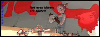
Post Reply

Return to “Artists Corner”