Practice makes perfect.

Digital art design, renderings, signatures and anything art related. Upload pictures of your newest work or ask for feedback. Post graphics requests or discuss art in general.
Post Reply
User avatar
rumpleKillskin
Loyal Member
Posts: 1934
Joined: Sat Jun 02, 2007 4:47 pm
Quick Reply: Yes
Location: Off Topic

Practice makes perfect.

Post by rumpleKillskin »

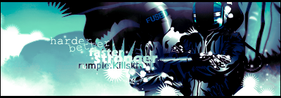
So I have been casually playing with photoshop and trying to get my skills up. I find it enjoyable now to just sit down photoshop while I listen to music. I was trying to learn how to use masks, filters, and overall try to fit multiple objects into one picture without it looking fake.

Here is what I got after playing with it for a bit. Any suggestions on stuff to add/fix? I am always up for advice!


Spoiler!
Image

Image

User avatar
*BlackFox
Forum Legend
Posts: 7921
Joined: Wed Sep 03, 2008 12:55 pm
Quick Reply: Yes
Location: Off Topic

Re: Practice makes perfect.

Post by *BlackFox »

Well, at the moment, I don't have any suggestions to give.
But damn.. It looks cool!
Image

User avatar
poehalcho
Elite Member
Posts: 6131
Joined: Mon Apr 30, 2007 3:32 pm
Quick Reply: Yes
Location: ┌(╬ಠ益ಠ)╯( ̄ー ̄)(ノ◕ヮ◕)ノ:・✧(╯°Д°)╯彡┻━┻ψ(`∇´)ψ(☞゚∀゚)☞¯\_(ツ)_/¯ლ(ಥ益ಥლ)ԅ༼ ◔ڡ◔༽งヽ༼ʘ̚ل͜ʘ̚༽ノᕕ(ᐛ)ᕗ( ͡° ͜ʖ ͡°)

Re: Practice makes perfect.

Post by poehalcho »

It still looks pretty obviously fake. for starters it doesn't blend in well due to it's sharpness. even the most upfront buildings don't show nearly as many details. you should blur the elephant a bit. second off the light play is wrong. most of the buildings seem to have a higher contrast and lower brightness. not only should the ass side be lighter, but the shadow on his foot below the stomach should be much darker.
you should perhaps also consider making a slight mist or w/e around his feet as seen around the buildings behind his feet

oh yeah. one more thing. the large tower in front of his head should have a shadow on his head...

EDIT:
another thing: might just be me, but the elephant seems to have a sort of white outline, like he hasn't been cut successfully from the stock image.

sorry if I sound harsh :P
I get really pissed of when I see incorrect examples of these type of images. So I'm really trying to help you correct it.
Image
Day[9] wrote:"Tea is a lot like gold expansions - it helps you kill people."
- Day[9] Daily 337 -

User avatar
rumpleKillskin
Loyal Member
Posts: 1934
Joined: Sat Jun 02, 2007 4:47 pm
Quick Reply: Yes
Location: Off Topic

Re: Practice makes perfect.

Post by rumpleKillskin »

Nah, I like the criticism. It gives me a reason to come back and touch up/add new features to the image. I have adjusted the contrast/brightness a bit right now. I am going to add a little more blur to the elephant and then work on adding shadow from the tallest building on his head.

If anyone else has suggestions don't be shy. 40 views and 2 comments means we either have a lot of lurkers or people are being too shy :P

Be creative! It's a work in progress.

EDIT: What is a good way of adding the shadow to his face for it too look realistic?
Image

Image

User avatar
Shomari
Advanced Member
Posts: 2341
Joined: Wed Jul 04, 2007 3:44 am
Quick Reply: Yes
Location: Limbo

Re: Practice makes perfect.

Post by Shomari »

cannot see.
My attention span is

Post Reply

Return to “Artists Corner”