
07


-
Hostage

- Veteran Member
- Posts: 3119
- Joined: Thu Jan 25, 2007 8:34 pm
- Quick Reply: Yes
- Location: Canada,On
Re: 07
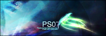
Oh, man SM ditch the border it's not doing the sig justice. 
It's not so much grainy....it seems the colours are distorted, like when you save something as a .gif. This is where I would assume something like topaz would come in handy but does Topaz even work with Ps7?
Anyways I really like the colours I would love to see more of that maroon/purplish through out the piece. Love the bold focal as well, draws your attention right from the get go.
Re: 07
I've never heard of topaz :p But looking it up I'm sure there's an outdated version that works with ps7, might look into it though might be too much work.
W/o border:

w/o border + purple:

Definitely agree without border is better, with the purple it feels kinda conflicting between warm/cold whereas originally it's clear it's cold. Though that might be because I added purple with selective color by dragging down cyan, might have to find a better way to do that.
W/o border:
w/o border + purple:
Definitely agree without border is better, with the purple it feels kinda conflicting between warm/cold whereas originally it's clear it's cold. Though that might be because I added purple with selective color by dragging down cyan, might have to find a better way to do that.

