Music <3

Digital art design, renderings, signatures and anything art related. Upload pictures of your newest work or ask for feedback. Post graphics requests or discuss art in general.
Post Reply
User avatar
0l3n
Elite Member
Posts: 5184
Joined: Fri Jun 16, 2006 1:45 pm
Quick Reply: Yes
Location: Artists Corner

Music <3

Post by 0l3n »

Ya'll know the drill!

I be representin' team DICE!! SHOUTOUT TO MAH HOMEBOIIS!!

ImageImage
ImageImage
Image
Image

User avatar
Kraq
Advanced Member
Posts: 2076
Joined: Sat Dec 15, 2007 3:44 am
Location: ☮☮☮

Re: Music <3

Post by Kraq »

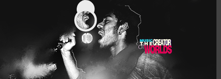
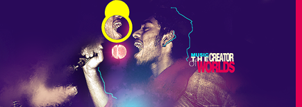
What is the difference between top and bottom?

I'm going to be a bit blunt here. Out of :love:

The effects seem to be everywhere, in the sense that there is no certain concept.
You have; some smudge, some pentooling, some vector, and some light source ball thingy(have you had the epiphany?).
I rather like the light ball thingy, if you expand on that, it would be one kick ass sig.
You have 2 light sources; soft blue brush and the pinkish light ball. Yet, none of it corresponds on the focal.

Lighting is a major part of blending.
Also, the 1px pentool on his hair looks very off. There is no hair visible, but you try to outline it. Makes him look bald :d


Next sig, make sure to make the lighting make sense ;o
Image

User avatar
0l3n
Elite Member
Posts: 5184
Joined: Fri Jun 16, 2006 1:45 pm
Quick Reply: Yes
Location: Artists Corner

Re: Music <3

Post by 0l3n »

Theres no difference between the top and bottom, just thought it looks better this way.

Your right, there really is no concept, im just trying my best to fill out enough empty space to make a tag, really having a hard time doing that for some reason, I guess when you take a break this long you forget certain techniques.
The blue crap really wasnt supposed to be a lightsource, its just that that part of the tag looked off so i brushed over it and added a texture. Perhaps I should have made the texture more prominent.

EDIT: :love: you for :love: me enough to be honest about it! :love:
Image
Image

User avatar
Skyve
Forum Legend
Posts: 7320
Joined: Thu Apr 13, 2006 4:42 pm
Quick Reply: Yes
Location: Canada

Re: Music <3

Post by Skyve »

I like the colored one :D I'm suprised by the number of "concepts/ideas" you have in this tag.I have a question, how was that background created? Did you just fill in with purple and made the render blend in (maybe Mask layer? )
Image

ExSoldier/Skyve/Loki

what is life even

User avatar
Shomari
Advanced Member
Posts: 2341
Joined: Wed Jul 04, 2007 3:44 am
Quick Reply: Yes
Location: Limbo

Re: Music <3

Post by Shomari »

I think it's better to learn technique before concept.
1st technique
2nd concept
Then blend the two.
cuz then you spend too much time trying to think of an idea and then base every little thing on that.

Looks pretty good imo. Just everything looks out of place.
Lighting is meh.
I rather like the pen tool :D


ExSoldier wrote:I have a question, how was that background created? Did you just fill in with purple and made the render blend in (maybe Mask layer? )

Screen maybe?
My attention span is

User avatar
Hostage
Veteran Member
Posts: 3119
Joined: Thu Jan 25, 2007 8:34 pm
Quick Reply: Yes
Location: Canada,On

Re: Music <3

Post by Hostage »

T to the T was here.
Image
A few things;
One. Flow. There seems to be a lacking--I mean I can certainly see and appreciate the effort but the end result didn't pay off bud. It seems like it's just sitting there, no real movement what so ever which makes it hard to stare at. Two. I already said the exact same thing in another thread but your light sources aren't exactly reflected on your focal which leaves the sig a little flat. Last but most important! Typo, what did you do!?*mean face* lol. I feel it's a little squished. Personally think that it would look awesome if you enlarged and then had the typo arranged so it took up all of the right side; this paired with your effects on the left would have a great balancing effect and help with the issue of flow I mentioned earlier. Like the colours however but I guess that's obvious considering my sig. =P

User avatar
chrisorg
Active Member
Posts: 872
Joined: Wed Jul 04, 2007 2:11 pm
Quick Reply: Yes
Location: Artist Corner

Re: Music <3

Post by chrisorg »

Whats up with the teams? :D
Image

User avatar
0l3n
Elite Member
Posts: 5184
Joined: Fri Jun 16, 2006 1:45 pm
Quick Reply: Yes
Location: Artists Corner

Re: Music <3

Post by 0l3n »

chrisorg wrote:Whats up with the teams? :D


Not much, I just opened pandoras box.
Image
Image

Post Reply

Return to “Artists Corner”