Digital art design, renderings, signatures and anything art related. Upload pictures of your newest work or ask for feedback. Post graphics requests or discuss art in general.
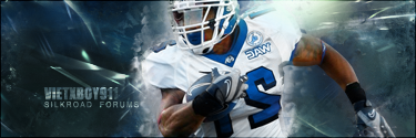
-- New Signature ; Dead Space -- Which one you prefer? The first one is my Normal version,while the other one is highly constrasted. -- Critics,Comments,Suggestions,etc.
blurring gives it some depth and the contrast... well it looks better i think since it sets focus to it
How do you explain a naked woman to a pubescent, visually impaired teen? "Katsumi arches unnaturally over a coffee table. You can see the whole thing."
Looks not bad but focus on flow, try to work more on small details and don't overcontrast in as in v3. Create interesting background. It's better than ur first works and things that wins in this sig are colors.
Your worst one to date; bad choice of render, oversized render, little variety in effects, practically no depth nor lighting. Looks like a 5 minute work of yours, and 5 minute works are never good. Chose your render wisely and don't screw the compo like in this one.
Melez wrote:Your worst one to date; bad choice of render, oversized render, little variety in effects, practically no depth nor lighting. Looks like a 5 minute work of yours, and 5 minute works are never good. Chose your render wisely and don't screw the compo like in this one.
Critic taken I really wanted to do a tag on that render because the guy looked so cool
contrasted no blur. although even that one seems to have too much blur imo. it looks awkward, also remove border >_>.
I won't say it looks bad, it doesn't annoy me the slightest to look at, compared to many other sigs, but try balancing the shape of the blur. it's kinda weird that one arm has a much larger blur than the other.
make a slightly higher contrast in the background too... it's kinda too neutral to be interesting.
Day[9] wrote:"Tea is a lot like gold expansions - it helps you kill people." - Day[9] Daily 337 -