Digital art design, renderings, signatures and anything art related. Upload pictures of your newest work or ask for feedback. Post graphics requests or discuss art in general.
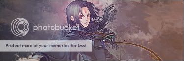
Although you did a good job, I think you could clean it up a little around your character. I can see some pixels that look like they dont belong. Other than that, super cool
O o /¯____________________________ ______________________________ ___/ | I'M A FIRIN MAH LAZOOR! BLAAAAAAAAAAARGHHH \_¯¯¯¯¯¯¯¯¯¯¯¯¯¯¯¯¯¯¯¯¯¯¯¯¯¯¯¯ ¯¯¯¯¯¯¯¯¯¯¯¯¯¯¯¯¯¯¯¯¯¯¯¯¯¯¯¯¯¯ ¯¯¯\
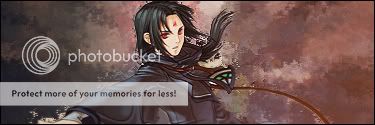
I feel like number 4 just looks faded out compared to the others. Am I missing something?
O o /¯____________________________ ______________________________ ___/ | I'M A FIRIN MAH LAZOOR! BLAAAAAAAAAAARGHHH \_¯¯¯¯¯¯¯¯¯¯¯¯¯¯¯¯¯¯¯¯¯¯¯¯¯¯¯¯ ¯¯¯¯¯¯¯¯¯¯¯¯¯¯¯¯¯¯¯¯¯¯¯¯¯¯¯¯¯¯ ¯¯¯\
Montolio wrote:I feel like number 4 just looks faded out compared to the others. Am I missing something?
Oh no good sir. Stop while you can!It's dangerous to form an opinion out side the general consensus formed by the passels of the A which leads to the C. Oh now! I've said to much.......* runs before the phantom fanged Lime catches him*
In seriousness, agreed. They all look terribly faded, that vibrant life like feeling an art piece should have is missing. And the outerglow added only adds to the lifeless "last minute" slaped on feel to it. Sorry Iz, this is a down step for you. Don't fall into the trend some of the other new generation AC poster have fallen into and that is to mass produce sigs...take your time and leave aside you sig once in a while and come back looking at it in a new perspective each time. I can assure you each tiem you will have a new opinion/idea and that much more to add to it finally giving it that completed look...OMG to much text for small font I must leave now!
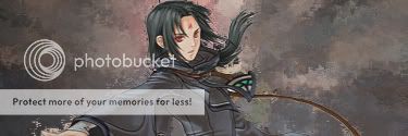
So far, I would say that Soren is much more the focal point in V2 than he is in all the others, but like I said earlier, it just needs cleaned up a bit. I also feel that the sig is missing something. I don't know what, but if I figure it out, I'll be sure to let you know!
O o /¯____________________________ ______________________________ ___/ | I'M A FIRIN MAH LAZOOR! BLAAAAAAAAAAARGHHH \_¯¯¯¯¯¯¯¯¯¯¯¯¯¯¯¯¯¯¯¯¯¯¯¯¯¯¯¯ ¯¯¯¯¯¯¯¯¯¯¯¯¯¯¯¯¯¯¯¯¯¯¯¯¯¯¯¯¯¯ ¯¯¯\
Montolio wrote:I feel like number 4 just looks faded out compared to the others. Am I missing something?
Oh no good sir. Stop while you can!It's dangerous to form an opinion out side the general consensus formed by the passels of the A which leads to the C. Oh now! I've said to much.......* runs before the phantom fanged Lime catches him*
In seriousness, agreed. They all look terribly faded, that vibrant life like feeling an art piece should have is missing. And the outerglow added only adds to the lifeless "last minute" slaped on feel to it. Sorry Iz, this is a down step for you. Don't fall into the trend some of the other new generation AC poster have fallen into and that is to mass produce sigs...take your time and leave aside you sig once in a while and come back looking at it in a new perspective each time. I can assure you each tiem you will have a new opinion/idea and that much more to add to it finally giving it that completed look...OMG to much text for small font I must leave now!
Thanks for the advice in small font, it helped alot