Digital art design, renderings, signatures and anything art related. Upload pictures of your newest work or ask for feedback. Post graphics requests or discuss art in general.
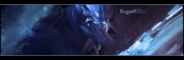
First one looks good, you might want to make the focal a bit more visible becuase I cant for my life see what it is.
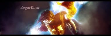
2nd one is not as good as the first one. Text is to simple, the blue really doesnt belong there. So if you would remove the blue effect I think it would be great.