Digital art design, renderings, signatures and anything art related. Upload pictures of your newest work or ask for feedback. Post graphics requests or discuss art in general.
You can't have the one with the black text because it is over a somewhat Black Background, the font isn't the easiest thing to read, but you still can, overall I think it's good
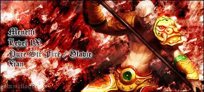
themskillz wrote:its actually glaive, not glavie, but if youre 1x, people will understand i think
have you check the silkroad online website its glavie and everyone knows there are a million spelling mistakes in-game, so im going by the website not the game that misspells things like bronze (its spelt bronz on the hunter bow). But maybe it is wrong, its only takes 10 seconds to edit anyway
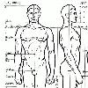
do u have one of those "skill user" things for lighhtning