Digital art design, renderings, signatures and anything art related. Upload pictures of your newest work or ask for feedback. Post graphics requests or discuss art in general.
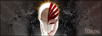
sig dos, ehh, outerglow text=bad O.o, but yea, not much flow,and the background is kinda simple, its a good effect, but you have to use it more than just that., but +1 for bleach.
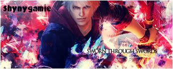
sig tress, good effects, but focal point!
for all three texts, bring them closer to the render, in general, you want 1, one, uno, 1, just one, focal point, having the text all over the place throws off the look of the sig