Digital art design, renderings, signatures and anything art related. Upload pictures of your newest work or ask for feedback. Post graphics requests or discuss art in general.
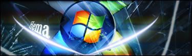
I like it ^^ you should enter it in the sig wars. I personally would erase the effects on the windows sphere and add some lensflare or more lighting effects. the line on the right side is destroying the flow, perhaps you should remove it and add more effects coming behind the sphere and going outwards =) Nice improvements!
i like it alot. The only thing i dont like is the text. I dont think the font really fit. And you should erase the effects on the windows tag. and i agree with GT the glowlines looks a little bit weird. But i have seen improvment. GJ! <3