TY So much!!!!
-Close
Search found 169 matches
- Mon Apr 06, 2009 5:37 pm
- Forum: Sig Requests
- Topic: Sig Request: Lil Wayne
- Replies: 4
- Views: 1343
- Wed Mar 25, 2009 11:07 am
- Forum: Sig Requests
- Topic: Sig Request: Lil Wayne
- Replies: 4
- Views: 1343
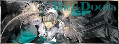
Sig Request: Lil Wayne
Name: BiigDogg or Biig Dogg (Which ever you think is better)
Size: MED - 375x125
Content: Lil Wayne Render and bright colors and glowy lines would be kool.
Additional Comments/Information/Gratitude: I just want a good lil wayne sig
Size: MED - 375x125
Content: Lil Wayne Render and bright colors and glowy lines would be kool.
Additional Comments/Information/Gratitude: I just want a good lil wayne sig
- Tue Mar 10, 2009 6:29 pm
- Forum: Artists Corner
- Topic: NSR - BookWorm
- Replies: 20
- Views: 1094
Re: NSR - BookWorm
You guys are silly... That three in every version goes right along with the tag... Its a chalk board, am i the only one that thinks that?
- Tue Mar 10, 2009 6:22 pm
- Forum: Artists Corner
- Topic: NSR~Faith
- Replies: 9
- Views: 796
Re: NSR~Faith
The texture is Perfect... Very sensual. The only thing that comes to mind, and may not be so just comes to mind is that it's a bit empty on the right side... Maybe Your own name somewhere there in a larger text.
- Sat Mar 07, 2009 1:39 am
- Forum: Artists Corner
- Topic: NSR ~ Chris Brown
- Replies: 6
- Views: 637
Re: NSR ~ Chris Brown
DumboDii wrote:First of all it's way too big.
ok, noted. When i size it correctly what else would you suggest I fix?
- Sat Mar 07, 2009 12:55 am
- Forum: Artists Corner
- Topic: Tutorial : Beauty (56K WARNING!)
- Replies: 21
- Views: 3838
Re: Tutorial : Beauty (56K WARNING!)
Hey, anyway you can get that tut back... alot of the tuts are disappearing... I guess they're too old or something, but i would love to get a hold of them. Thanx
- Fri Mar 06, 2009 10:24 pm
- Forum: Artists Corner
- Topic: Blah blah new sig
- Replies: 6
- Views: 778
Re: Blah blah new sig
Simple, which i like. Colors make the stock seem raw, like im looking at a real police poster or something. Text is a little small, but *squint* i can read it. Brushes seem random, but right, if that makes sense.
Overall i like it.
Overall i like it.
- Fri Mar 06, 2009 7:37 pm
- Forum: Artists Corner
- Topic: NSR~Raiden
- Replies: 4
- Views: 782
Re: NSR~Raiden
I simpathize with not remembering all the techniques... Remember the smudge tool, blends the stock with the BG... A new layer with gradient and lighting effects is always a good idea... make the colors work together.
- Fri Mar 06, 2009 6:56 pm
- Forum: Artists Corner
- Topic: NSR ~ Chris Brown
- Replies: 6
- Views: 637
NSR ~ Chris Brown
I am really noob at sigs. To be honest, i don't know what NSR means im just following the crowd. I have nothing else to do so im trying to get back into sigs. I dont remember any techniques. CnC and advice for making better sigs would be nice! http://i228.photobucket.com/albums/ee217/DOAMASTER0/Sigs...
- Fri Mar 06, 2009 6:40 pm
- Forum: Artists Corner
- Topic: NSR ~ Aion
- Replies: 6
- Views: 690
Re: NSR ~ Aion
It is a good concept, the grey and all, but as others have mentioned, it's a little too empty on the right... you just need something there.
- Sun Sep 23, 2007 8:30 pm
- Forum: Artists Corner
- Topic: NSR~ Sexy Blue
- Replies: 5
- Views: 399
I dont like the font sorry :s Try to change it and also make it tinyer I know nothing about Text.. I try to keep it out of the way and thats about it... Ill try making the Text smaller the right side background needs to be toned down a bit, maybe smudged a bit? Ill try that Thank you Very much... I...
- Sun Sep 23, 2007 5:13 pm
- Forum: Artists Corner
- Topic: NSR~ Blade
- Replies: 5
- Views: 369
- Sun Sep 23, 2007 5:04 pm
- Forum: Artists Corner
- Topic: NSR~ Blade
- Replies: 5
- Views: 369
- Sun Sep 23, 2007 5:01 pm
- Forum: Artists Corner
- Topic: NLPR - Life
- Replies: 14
- Views: 641
- Sun Sep 23, 2007 4:57 pm
- Forum: Artists Corner
- Topic: NSR~ Sexy Blue
- Replies: 5
- Views: 399
NSR~ Sexy Blue
New Sig Tryed Different Tutorial/Style...
Comments and Criticism Welcome... I am a begginer and need help! Thank You.
Comments and Criticism Welcome... I am a begginer and need help! Thank You.
- Sun Sep 23, 2007 2:37 pm
- Forum: Artists Corner
- Topic: Sig generators
- Replies: 13
- Views: 676
- Sun Sep 23, 2007 2:36 pm
- Forum: Characters and Skills
- Topic: 80:80 spear pvp
- Replies: 53
- Views: 2652
UnDutchable wrote:JessicaYan wrote:Hey, I have 70:70 build too. What is your exact balance with blues? Your dmg is pretty good.
My balance is 80:86 now, if i max all my int/str points i could maybe get to a 81:87 balance.
And yes they ALL were 80.
In yo Face ALL 80 ^_^... ur GODLY nd i hate u for now
- Sun Sep 23, 2007 2:22 pm
- Forum: Artists Corner
- Topic: NSR~ Blade
- Replies: 5
- Views: 369
NSR~ Blade
This seems to be my best sig yet.. I used a tutorial from another random forum Please rate and Comment on how i can make better Please i really need the criticism http://i228.photobucket.com/albums/ee217/DOAMASTER0/Sigs/BiigDogg-Blade.jpg Edited This is The same one without Text and 1 of the blur la...
- Sun Sep 23, 2007 2:19 pm
- Forum: Artists Corner
- Topic: Sig generators
- Replies: 13
- Views: 676
- Sun Sep 23, 2007 2:17 pm
- Forum: Artists Corner
- Topic: NSR - Epic Battle
- Replies: 12
- Views: 690
- Sun Sep 23, 2007 2:05 pm
- Forum: Artists Corner
- Topic: New Sig
- Replies: 11
- Views: 448
- Sun Sep 23, 2007 2:01 pm
- Forum: Artists Corner
- Topic: NSR - Epic Battle
- Replies: 12
- Views: 690
- Sat Sep 22, 2007 9:15 pm
- Forum: Artists Corner
- Topic: NSR - Epic Battle
- Replies: 12
- Views: 690
May be off Topic but, what does NSR mean??? Umm it seems ok to me that text is better than anything that i can do and seems rightly placed... I didnt have trouble noticing it was 2 charecters there but they dont seems to match.. Like from 2 different games or movies just dont go together thats all 8...
- Mon Sep 17, 2007 4:36 am
- Forum: Artists Corner
- Topic: NSR~
- Replies: 10
- Views: 641
- Fri Sep 14, 2007 3:25 am
- Forum: Artists Corner
- Topic: Which sprite tag is better
- Replies: 5
- Views: 389
#1>#2 #1 Seems as though the render/character is coming out of some mist or smoke.. it has an effect on my mind that the smoke is moving. i like it very much. Im not good with critisizing Text im horrible at it, but i dont mind it the yellow text above is quite small and almost invisible to a quick ...
- Fri Sep 14, 2007 3:20 am
- Forum: Artists Corner
- Topic: NSR~
- Replies: 10
- Views: 641
Went too far on lighting effects and not enough on others. The colors you choose were a sort of happy cynical, which is my way of saying cold colors w/o black. Although they match your sprite, the colors near the sprite itself does not make your render stand out. The light-------->dark contrast tha...
- Fri Sep 14, 2007 3:12 am
- Forum: Artists Corner
- Topic: High res SilkRoad Logo
- Replies: 8
- Views: 576
- Fri Sep 14, 2007 2:43 am
- Forum: Guides and Tutorials
- Topic: Bow build 70:70 GUIDE Updated 3.0!
- Replies: 1440
- Views: 238394
- Thu Sep 13, 2007 4:05 am
- Forum: Artists Corner
- Topic: [Help] I cant Make My Brushing look Good
- Replies: 12
- Views: 1337
ah edgetext, I see you have returned to torment me once again! and yes i Have read all the tutorials Someone's a liar. And No i am not a liar i have read all of them... Even the ones that dont seem to work... I wouldnt lie to you.. I'm Biig Dogg Don't DP. And btw, you can always make your text smal...
- Tue Sep 11, 2007 3:40 am
- Forum: Artists Corner
- Topic: [Help] I cant Make My Brushing look Good
- Replies: 12
- Views: 1337